文章目录[隐藏]

sketch,其本质是一个矢量绘图工具。所有的设计都是由一些形状或形式矢量图层,这样一来就能轻松地编辑这是非常重要的。这就是为什么我们决定把重点放在提高矢量编辑在此更新中 - 加改进整个主机,并增加一次修改多个形状的能力。
编辑
试想一下,如果你在你的设计形状复杂,你需要对其进行编辑。它是由许多子路径,并在每个这些都是你需要移动来调整形状点。这意味着选择每一层,编辑,并重复了吧?那么你会很高兴听到事情已经成为了很多更直接!在草图40,你现在可以简单地按上形回车键即可显示所有的点和其中包含的路径,无论多少层的存在。选择多个点,在不同层次,您可以一次,而不需要单独选择每个层进行调整。

形状甚至不需要是为了子路径同时进行编辑。您可以选择多种不同的形状图层,并进入编辑模式,开始进行更改。新层甚至可以添加为子路径不退出模式。
还有更多的改进和小修正也被列入本次更新的矢量编辑器,所以一定要检查出的发行说明,查看他们所有的细节。我们最喜欢的是:
- 当你将鼠标悬停在一个路径,现在草图显示你到底在哪一个新的点会被插入。这种行为是总是可能的,但现在它有点不太隐患。
- 目前徘徊在矢量点的时候是一个新的光标。这一切都在细节中!
- 现在,当你去编辑一个开放路径,最后一点是选择,而不是第一个。适合继续你离开的地方。
文本转换
这不是一个新的功能完全相同,但有一个已经完全改进 - 执行文本中的任何范围内的文本转换的方式,非破坏性的能力。这意味着您可以风格你的文本,它的大写,小写或无需重新键入。

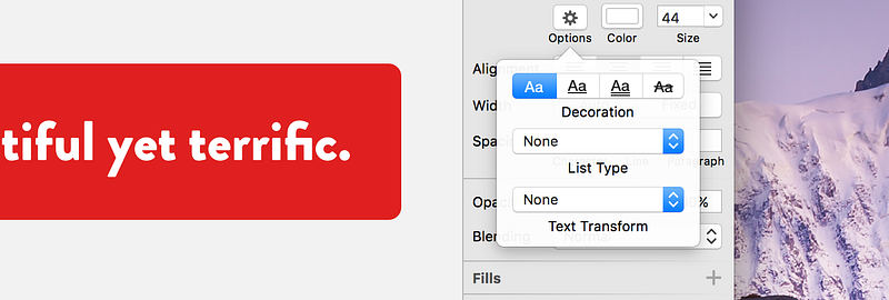
应用转换到一个文本层,进行选择,然后点击选项按钮在检查。在这里,你会发现一个新的下拉按钮,选择您的转换。如果你想重新回究竟它是如何输入,只需选择从弹出菜单中选择无。

其他改进
我们还针对您的惊人的反馈做了一些其他的改进和补充。一些亮点包括:
- 撤消的速度显著改善,特别是在复杂的文件
- 现在可以更轻松上传草图文档作为云新共享
- 缩放对话框现在还记得从哪个角落,你缩放最后一次
- 出现一个符号主人的边界之外图层现在也可以通过他们的可见区域的画板之外的选择
- 选择在复杂的文档图层时提高性能
官方插件
几个星期前,你可能已经看到,我们发布了第一个正式的插件,以帮助压缩导出的文件; SVGO压缩机和 sketch图像压缩。这两个插件将因为它们是从草图导出分别尽快优化SVG和所有位图文件。我们鼓励您检查出来,我们希望他们都成为您的工作流程要领。

我们希望你下载这个免费的更新!
原文:
Improved Vector Editing and More

Sketch, by its very nature is a vector drawing tool. All of your designs are made up of vector layers in some shape or form, so it’s incredibly important to be able to edit them with ease. That’s why we decided to focus on improving vector editing in this update — adding a whole host of improvements, and adding the ability to edit multiple shapes at once.
Editing
Imagine if you have a complex shape in your design, and you need to edit it. It’s made up of many subpaths, and within each of these are the points that you need to move to adjust the shape. That means selecting each layer, edit it, and repeat, right? Well you’ll be pleased to hear things have become a lot more straight forward! In Sketch 40, you can now simply press the Enter key on that shape to reveal all the points and paths contained within it, no matter how many layers are there. With multiple points selected, across different layers, you can adjust them at once without the need to select each layer individually.

Shapes don’t even need to be subpaths in order to be edited at once. You can select many different shape layers and enter the edit mode to begin making changes. New layers can even be added as subpaths without exiting the mode.
Many more improvements and minor fixes have also been included to the vector editor in this update, so be sure to check out the release notes to view them all in detail. Our favorites are:
- When you hover over a path, Sketch now shows you where exactly a new point would be inserted. This behavior was always possible, but now it’s a little less hidden.
- There’s a new cursor when hovering over vector points. It’s all in the details!
- Now when you go to edit an open path, the last point is selected instead of the first. Perfect for continuing where you left off.
Text Transform
This is not a new feature exactly, but one that’s been completely improved — the ability to perform a text transform on any range of text in a way that is non-destructive. This means you can style your text so it’s uppercase, or lowercase without having to re-type it.

To apply a transform to a text layer, make a selection and click the Options button in the Inspector. Here you’ll find a new dropdown button to choose your transform. If you wanted to reset it back to exactly how it was typed, just select None from the pop-up menu.

Other Improvements
We’ve also made a few other improvements and additions in response to your amazing feedback. Some highlights include:
- The speed of undo is significantly improved, especially in complex documents
- It’s now easier to upload a Sketch document as a new share on Cloud
- The Scale dialog now remembers from which corner you scaled last time
- Layers appearing outside a Symbol master’s bounds can now also be selected by their visible area outside the Artboard
- Improved performance when selecting layers in complex documents
Official Plugins
A couple of weeks ago, you may have seen that we released our first official plugins to help with compressing exported files; SVGO Compressor, andSketch Image Compressor. These two plugins will optimize SVG, and all bitmap files respectively, as soon as they are exported from Sketch. We encourage you to check them out, and we hope they both become essentials in your workflow.

We hope you’ll download this free update, and check out all that’s new for yourself! If you need to, please don’t hesitate to reach out to us via oursupport page, Twitter or Facebook channels. Let’s continue to make Sketch the better, together.
原创文章,作者:ioued,如若转载,请注明出处:https://www.iamue.com/17841/
